At the Build 2017 conference, Microsoft revealed upcoming changes to the way applications will be (and can be) designed, introducing their Fluent Design System in the Windows 10 Fall Creators Update. This update focuses on the role which light, depth, motion, material, and scale can play in the design of user interfaces (UIs): really nice and impressive stuff which can certainly be used to improve user experiences. However, given that it has been a recurring theme in UI design to prioritize aesthetics over usability, I want to take a critical look at one of the newly introduced features—reveal highlight.
Reveal uses light to make interactive elements stand out. Light illuminates the interactive element the user can interact with, revealing hidden borders. The light also gently illuminates other interactive elements that are nearby.
… The Reveal behavior does this by revealing the clickable content’s container when the pointer is nearby.
For example, see the difference between the calculator application in Windows 10 and the same calculator using ‘reveal’.
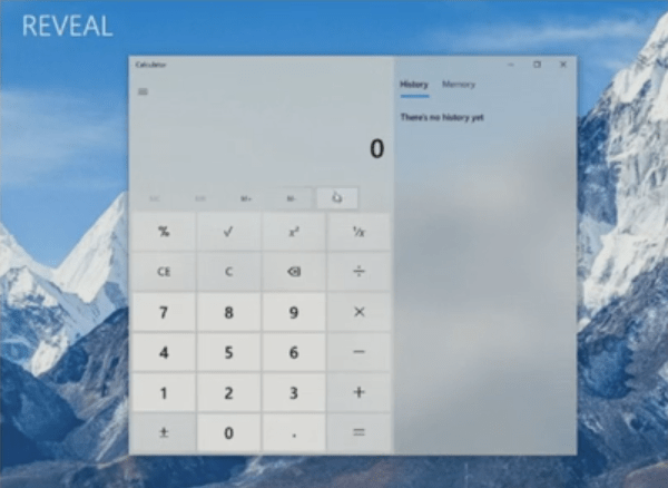
Certainly an improvement, but at this point I feel it is worthwhile to take a couple more steps back to compare this with what the calculator looked like in Windows 7.
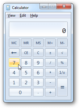
Less pretty, to be sure, but notice in particular how there is no need to hover over the memory buttons to perceive that they can be clicked and where to do so. To me, the UI modifications introduced as part of Windows 8 and 10 are two steps back and ‘reveal’ is one step forward, mitigating some of the earlier mistakes: the power of perceived affordances took a backseat to ‘flat design’, effectively stripping many UI elements of their clarity in how they can be used: where to click, can they be clicked, and what type of element it is. The question I would like to ask is: Should buttons ever look like ordinary labels in the first place?
While it is awesome to have additional development tools available to create more pleasing ‘on hover’ effects, conceptually this is nothing new. From a design perspective, it would still not make sense to require a user to hover over important UI elements to only then be able to interpret what they are. Therefore, at this point I would merely like to highlight that ‘reveal’ with the purpose of revealing functionality should likely be used sparingly, only for non-essential user interface elements. Whether or not the memory buttons in the calculator are ‘important’ (and potential alternate ways of visualizing them) is a different discussion to be had.
As researchers in user interface design know, perceived affordances improve usability. Conversely, I blogged about how the lack of affordances in the window manager of Windows 10 complicates resizing and moving windows around. Ironically, this was demonstrated perfectly by Ashish during his presentation on how to use the Fluent Design System features in XAML, as he spent 32 seconds on resizing a window to its desired size while narrating “Sorry. If this machine cooperates.” and Tim helpfully instructing him that he is “anchoring [the window] too high …”.
The (literal) bottom line of this post: great new stuff in Windows (and XAML), but I hope this post serves as a warning to think of usability first when using the new Fluent Design System features, aesthetics only second.

 whatheco.de