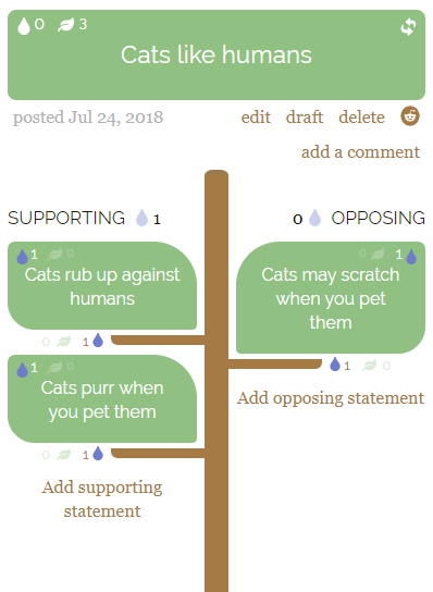
Over a year ago I announced Socratrees, a platform to support online argumentative discussion.
Complex interrelations between different statements which make up an argument are often hard to follow, or hard to contribute to, when forced into a linear format. This is an unfortunate characteristic of essentially all modern media used to present arguments and host discussions. Socratrees offers an alternative by outlining arguments into intuitive hierarchies of supporting and opposing statements.
Our mission statement reads as follows:
Transparency first: our primary goal is not to find out who is right or wrong, but to improve transparency of thought.
Finding common ground: encourage consensus building, to build unity.
Inclusiveness: represent all opinions, also minorities and repressed groups.
Facilitate conducive discussions.
Inspire critical thinking.
Since the start of this month, the site is now in private beta during which we will evaluate how well our current design supports these goals and how it can be approved upon. This contributes to research on argument technologies. Join private beta and help us make discussions great again!
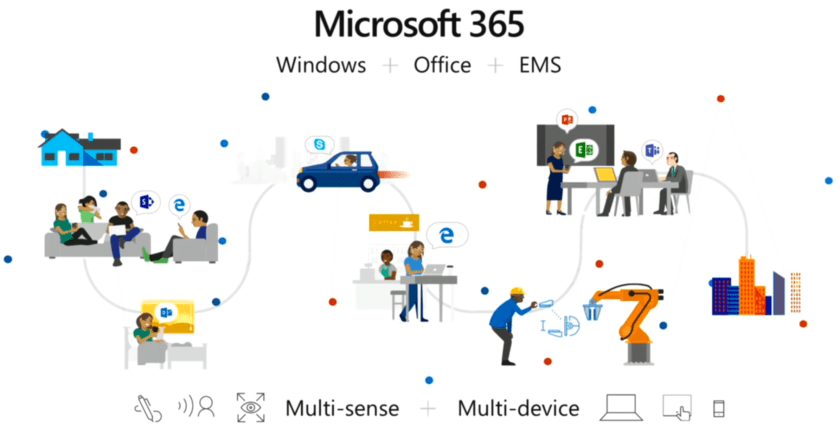
During the vision keynote at Microsoft Build 2018, Satya Nadella introduced the Microsoft 365 platform, a new technology which aims to improve the integration between different Microsoft products and devices (and even other vendors). As great as that is, the underlying motivation is much more interesting and reads like the introduction to a typical paper on activity-centric computing—a line of research originating in the 80s (referred to in my earlier writing as ‘activity-based computing’) which argues for an alternative to the current file-, window-, and application-dominated user interface paradigm.
During a single day you’re using multiple devices, you’re at multiple locations, working with multiple people, and interacting using multiple senses. That is the world we already live in. We need an operating system, we need a platform, that abstracts the hardware at that level, that creates an app model at that level. Single devices will remain important, but this ‘meta orchestration’ is what we need to do. We need to ‘up level’ even our concept of what an operating system is. And that is what Microsoft 365 does. – Satya Nadella, Microsoft Build 2018
This ‘meta orchestration’ is what research prototypes in activity-centric computing typically support by introducing ‘computational activities’ which can be managed by the user or inferred by the system, can be suspended and resumed, can roam across devices, and can be shared with others.
Activity-centric computing addresses deep-rooted information management problems in traditional application-centric computing by providing a unifying computational model for human goal-oriented ‘activity’, cutting across system boundaries. – Upcoming review on activity-centric computing.
Certainly, Microsoft is aware about activity-centric computing and has even contributed to it in the past (e.g., Scalable Fabric and Project Colletta). Even more, Satya starts the keynote by quoting Weiser who first introduced the term ubiquitous computing, a related and overlapping field of research.
The most profound technologies are those that disappear. They weave themselves into the fabric of everyday life until they are indistinguishable from it. – Mark Weiser, The Computer for the 21st Century
But, what is really exciting about this announcement is that this is the first time a major software company seems to embrace (and publicly announce) this as the future of computing. In the past, a research group at Apple Computer (including Donald Norman) has toyed with the idea, IBM has a suite of collaboration tools supporting activities, and some features (such as virtual desktops) have been slowly incorporated into most operating systems. But for activity-centric computing to truly succeed it needs to be integrated into the very fabric of computing. In research, most prototypes have largely been inhibited by having to build on top of the very infrastructure they set out to change. As I conclude in my PhD thesis on Task and Interruption Management in Activity-Centric Computing:
Norman and Verganti compare incremental innovation with radical innovation through the use of a hill-climbing analogy: “Incremental innovation attempts to reach the highest point on the current hill. Radical innovation seeks the highest hill”:
… [activity-centric computing] envisions a radically new computing paradigm incompatible with the current antiquated desktop metaphor for office work. Building activity-centric computing systems is a continuous uphill battle against an industry which is only trying to achieve local maxima. In contrast, activity-centric computing pursues radical innovation, aiming for one unifying global maximum.
With the introduction of Microsoft 365, Microsoft is taking its first steps towards a new infrastructure which could potentially host this new computing paradigm and its entailing principles.
The world’s applications going forward need a ubiquitous computing fabric from the cloud to the edge. They need a new app model that is distributed, event-driven, and serverless. – Satya Nadella, Microsoft Build 2018
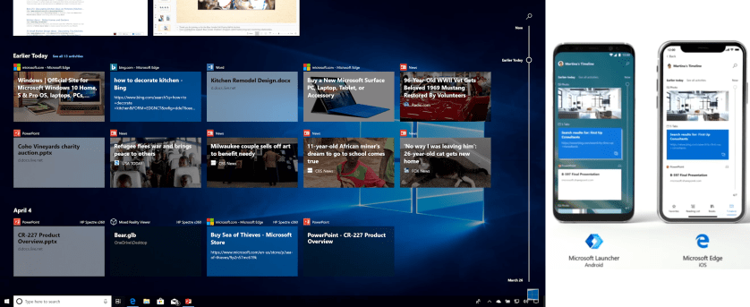
This is reflected in some of the other announcements, such as live code sharing between Visual Studio and Visual Code (which in research we call ‘activity sharing’), application-less event handlers hosted using Azure functions and adaptive cards which can host content within other applications (decoupling of functionality and applications), but perhaps most clearly by how ‘computational activities’ will be represented in Windows 10 going forward.
With timeline, the basic idea is that the things that you do on your PC, or other devices, are available in a single click from the taskbar. You can scroll back through time, see everything you were working on, and just click to resume. Now, the key idea here though is that timeline is based on the Microsoft Graph and therefore it enables cross-device experiences [including iPhone browsing history]. – Joe Belfiore, Microsoft Build 2018
This history of the user’s interactions across devices are not in themselves ‘computational activities’. Computational activities require the ability for the user to aggregate disparate resources (managed by separate applications), such as web pages, Office documents, images, etc. This, Microsoft has decided to implement as what they call ‘sets’. In 2012 I discussed why traditional tabbed windows (managed by a single application) are inherently broken, and suggested how an implementation similar to ‘sets’ might lead to more scalable window management. With sets, all work related to a single ‘activity’ can be grouped under a single window using multiple tabs (regardless of the application used). More importantly, this ‘activity’ window can be closed without losing work and retrieved at a later moment in time when ready to resume work (which in research we call ‘activity suspend and resume’). Furthermore, this can even be done on a different device than where the work was first initiated (which in research we call ‘activity roaming’).
In my own research, I implemented similar features on top of Windows 7 in a system called ‘Laevo’, but in addition also looked at how activity planning and the handling of to-do items (traditionally supported by electronic calendars) can be integrated with such ‘computational activities’ or ‘sets’; why duplicate the effort of managing items in a calendar when they are already represented as activities?
Most of the time spent implementing such novel new systems is on ‘hacking’ the operating system and applications you intend to support to become ‘activity-aware’, and building a distributed ‘activity model’ which different devices can use to show and resume activities. With Microsoft Graph, Microsoft is building the necessary distributed infrastructure to start building such ‘activity models’ and is encouraging application developers to integrate with it; an essential step towards moving activity-centric computing from ‘the lab’ into production.
It thus seems Microsoft is finally implementing activity-centric computing as it was first envisioned in 1986 by Yoshiro Miyata and Donald A. Norman, targeting radical innovation as opposed to incremental innovation. There is still a long way to go towards incorporating other aspects of the original conceptualization of personal computing (as demoed by Alan Kay in the video below), but this is definitely a step in the right direction!
Alan Kay giving a demo of what commercial personal computers (unfortunately) did not turn out to be: https://t.co/hKybCLJ8ME
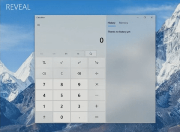
At the Build 2017 conference, Microsoft revealed upcoming changes to the way applications will be (and can be) designed, introducing their Fluent Design System in the Windows 10 Fall Creators Update. This update focuses on the role which light, depth, motion, material, and scale can play in the design of user interfaces (UIs): really nice and impressive stuff which can certainly be used to improve user experiences. However, given that it has been a recurring theme in UI design to prioritize aesthetics over usability, I want to take a critical look at one of the newly introduced features—reveal highlight.
Reveal uses light to make interactive elements stand out. Light illuminates the interactive element the user can interact with, revealing hidden borders. The light also gently illuminates other interactive elements that are nearby.
… The Reveal behavior does this by revealing the clickable content’s container when the pointer is nearby.
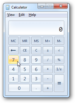
Certainly an improvement, but at this point I feel it is worthwhile to take a couple more steps back to compare this with what the calculator looked like in Windows 7.
Less pretty, to be sure, but notice in particular how there is no need to hover over the memory buttons to perceive that they can be clicked and where to do so. To me, the UI modifications introduced as part of Windows 8 and 10 are two steps back and ‘reveal’ is one step forward, mitigating some of the earlier mistakes: the power of perceived affordances took a backseat to ‘flat design’, effectively stripping many UI elements of their clarity in how they can be used: where to click, can they be clicked, and what type of element it is. The question I would like to ask is: Should buttons ever look like ordinary labels in the first place?
While it is awesome to have additional development tools available to create more pleasing ‘on hover’ effects, conceptually this is nothing new. From a design perspective, it would still not make sense to require a user to hover over important UI elements to only then be able to interpret what they are. Therefore, at this point I would merely like to highlight that ‘reveal’ with the purpose of revealing functionality should likely be used sparingly, only for non-essential user interface elements. Whether or not the memory buttons in the calculator are ‘important’ (and potential alternate ways of visualizing them) is a different discussion to be had.
As researchers in user interface design know, perceived affordances improve usability. Conversely, I blogged about how the lack of affordances in the window manager of Windows 10 complicates resizing and moving windows around. Ironically, this was demonstrated perfectly by Ashish during his presentation on how to use the Fluent Design System features in XAML, as he spent 32 seconds on resizing a window to its desired size while narrating “Sorry. If this machine cooperates.” and Tim helpfully instructing him that he is “anchoring [the window] too high …”.
The (literal) bottom line of this post: great new stuff in Windows (and XAML), but I hope this post serves as a warning to think of usability first when using the new Fluent Design System features, aesthetics only second.
There is one upside to the recent election of president Donald Trump (yes, the title of this post is a pun) and the earlier withdrawal from the European Union by the UK: it has become a whole lot easier for me to pitch an idea which I’ve been advocating (with some opposition) for nearly a decade now. It is my hope that the project I’m announcing in this post will help fight fake news—possibly the main driving force behind these events.
Given the growing body of knowledge accumulated by mankind, most professions require an extreme degree of specialization. Nowadays, you can be the most knowledgeable person on one topic while simultaneously being the most ignorant when it comes to another. Yet, society seems to expect us to have an opinion on everything impacting our daily life, from climate change to immigration issues, regardless of whether or not we have a comprehensive understanding of the topic at hand. This is where media comes in, which is supposed to keep us up to date and well-informed.
However, there is a problem with modern media. Although today we can access more information, faster than ever before, we are still left to our own devices when it comes to judging how relevant or valid this constant stream of data is. Finding information is easy (and even hard to ignore), but evaluating it is more difficult than ever. Consequently, most of us rely on whatever sources we deem authoritative and form our opinions based on that. The current prevalence of misinformation and fake news indicates this poses a risk, but as I will argue here, is merely symptomatic of a larger underlying problem.
The different media we use today to share knowledge and host discussions unnecessarily segregate opposing views. For example, this blog post makes the case for an alternative medium for discourse, but the only way to contest parts of the containing argumentation (although overall you might agree) is by writing a reply in the comments section (separated from the main article). Only through a fair amount of clarification (e.g., by referring to certain sentences within the article) will it be made clear how your comments relate to the overall blog post and might we be able to carry forward a fruitful discussion. As you have likely experienced, similar discussions can easily turn into stressful conflicts (both online and in real life discussions). But why should this be so?
Debaters on comprehensive scientific problems are … like lawyers who have to take a side. Each of them intends to strengthen his own arguments and to weaken the arguments of the aggressor—but no judge is in the chair. … Finally we find ourselves all together in the same ship and are co-operating even when we think we are fighting one another.
— Otto Neurath (1940), “Universal jargon and terminology.”
Discussions are inherently collaborative. As opposed to lectures, during which information is handed to you on a platter, discussions encourage you to share your own world views. Naturally, this gives rise to disagreement; if we were all like-minded, conversations would be rather dull (in fact, there would be no discussion at all). However, disagreement should not be seen as conflict but rather as an opportunity to learn; a chance to explore and understand perspectives different from yours. Unfortunately, it is all too common to fall into the trap of turning a discussion into a lecture; to start preaching your own world views without seeking to understand those of others. But if your goal is truly to convince someone, it is all the more important to seek out common ground first. The ideal argument is tailored to the person you are talking to, not merely an elaborate summary of what you know. In short, a conducive discussion should be as much about listening as it is about talking.
As such, having a one-on-one discussion is difficult enough as is, but trying to do the same online (a medium everyone has access to) is near impossible. Unless the medium is designed with large-scale discussion in mind! A linear format is incapable of expressing the underlying complex structure of argumentation with multiple opposing views. It is up to the reader to mentally connect the different statements which make up a discussion, to find out how they contribute to a larger topic, and to understand which conclusions can be drawn from them.
For the past few years I have had a vision on how to improve discussions and argumentation on the internet (based on my experience with the extremely successful network of Q&A sites: Stack Exchange). Countless brainstorming sessions and reading on the side later have eventually culminated into the design of a social network website, Socratrees, currently under active development.
Introducing Socratrees: The Socratic Tree of Knowledge
Complex interrelations between different statements which make up an argument are often hard to follow, or hard to contribute to, when forced into a linear format. This is an unfortunate characteristic of essentially all modern media used to present arguments and host discussions. Socratrees offers an alternative by outlining arguments into intuitive hierarchies of supporting and opposing statements. This design is loosely based on argumentation theory. However, we do not expect you to be familiar with theory in order to start using Socratrees.
Over the next couple of months I will start announcing specifics and open up parts of the project to the public. When interested, you can already sign up for private beta which gives you an exclusive opportunity to help shape this project from the very beginning! Until then, we welcome any questions, ideas, or feedback on our dedicated subreddit.
Before heading out to the shooting range and placing Windows 10 on the target stand, let it be said that Windows 10 is a great improvement over Windows 8 and definitely a step in the right direction. However, this post is not concerned with overall impressions, neither with minor bugs which I’m certain will be ironed out over time. Rather, it sets out to highlight (call it nitpicking if you want) several annoying aspects of the redesigned window manager which I don’t expect to see changed any time soon. At first these seem like minute manageable details. However, when it comes to usability seemingly small issues can become a major annoyance when running into them on a regular basis, especially when they occur during moments of high workload where the window manager is already put under a great amount of stress.
“…the term affordance refers to the perceived and actual properties of the thing, primarily those fundamental properties that determine just how the thing could possibly be used. […] Affordances provide strong clues to the operations of things. Plates are for pushing. Knobs are for turning. Slots are for inserting things into. Balls are for throwing or bouncing. When affordances are taken advantage of, the user knows what to do just by looking: no picture, label, or instruction needed.”
Within user interface (UI) design, this means UI components should thus ‘afford’ clicking, dragging, moving, or any other operation that is supported by presenting the user with clear visual clues.
Window Manager in Windows 10
As Windows evolved, the styling of application windows was designed to be more and more in line with current minimalistic trends in interface design. Styling preferences aside, unfortunately this also introduces changes in the visible affordances to work with windows. In the following figure, notice in particular how the distinction between the title bar, the menu bar, and the window border are removed in subsequent versions of Windows.
Different styling of application windows in (from top to bottom) Windows 7, Windows 8, and Windows 10.
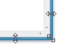
In Windows 7, there was a visible border above which the mouse pointer changed to a resize icon. There was thus an easy visible target to point to when resizing windows.
In Windows 10, all borders (except the top border) are invisible. To resize a window you need to hover over the empty area surrounding the window in order for the resize option to appear. Even more challenging is resizing the top right corner. Try figuring out where the resize option appears, as opposed to where the close button lights up! This is complicated immensely since the top border is visible (but overlayed by the close button starting from Windows 8), and the side border is invisible. Hovering over this area is quirky and unpredictable to say the least.
Moving windows:
The title bar can be used to move the application window using the mouse (click and drag). However, in Windows 10 there is no longer a visible separation between the title bar and the menu bar. [UPDATE: Microsoft has since released an update reintroducing colored title bars.] Note that the menu bar cannot be used to drag the window. The pointing task to move a window is thus complicated since there are no visual clues to determine whether a window can be dragged from a given position (not even on hover). However, since it seems the menu bar has been removed for modern Windows applications, this is mainly a problem for classic desktop applications (and will be until they are phased out).
Never require users to click an object to determine if it is clickable. Users must be able to determine clickability by visual inspection alone.
Primary UI (such as commit buttons) must have a static click affordance. Users shouldn’t have to hover to discover primary UI.
Secondary UI (such as secondary commands or progressive disclosure controls) can display their click affordance on hover.
[…]
For your convenience, the definitions (taken from Microsoft’s glossary) of some of the more obscure concepts listed above:
commit button—A command button used to commit to a task, proceed to the next step in a multi-step task, or cancel a task. […] primary command—A central action that fulfills the primary purpose of a window. For example, Print is a primary command for a Print dialog box. […] secondary command—A peripheral action that, while helpful, isn’t essential to the purpose of the window. For example, Find Printer or Install Printer are secondary commands for a Print dialog box. […] progressive disclosure—A technique of allowing users to display less commonly used information (typically, data, options, or commands) as needed. For example, if more options are sometimes needed, users can expose them in context by clicking a chevron button.
Using this terminology it can thus be argued Microsoft now considers window operations to be ‘secondary commands’, as opposed to ‘primary commands’. Personally I don’t find what in essence are invisible UI components good design, regardless of whether their functionality becomes visible on hover. More importantly, the lack of any visual distinction (even on hover) between the title bar and the menu bar contradicts Microsoft’s own design guidelines. It seems like usability took a backseat to styling, just for the sake of having a ‘flat’ look.
[…], in essence files are a remnant of the original desktop metaphor. Users are forced to mentally connect window representations to the files they represent. When restoring window configurations users are [unnecessarily] confronted with finding all the related files.
I reflect on this later in the discussion:
[…], raising interesting questions for further research on how window management can be redesigned to outgrow its original purpose. Further research on Laevo is therefore to increasingly move away from files, as their main intent of persisting information could be replaced by persisting window configurations […]
Taking this to the extreme: assume closing a window would be the same as deleting a file. Would you actually ever have to know about the underlying file system again? Window management and file management could become one and the same thing.
Originally I titled the current post, “From File Management to Time Management”, since one of the conceptual challenges I like to confront myself with is to design for never having to reopen a file again. Rather, I want to support revisiting the full context (including the window representation of the file) which the original file was part of. As a desktop interface, Laevo uses a temporal representation allowing you to revisit any prior, or planned activity in time.
However, after a yet again inspiring talk by Bret Victor on “The Humane Representation of Thought: a trail map for the 21st century” as the closing keynote of the UIST 2014 conference, I realized that just as file management is a remnant of the original desktop metaphor, so is window management. Windows are a side effect of the digital rectangles we’ve grown so accustomed to within our lives. Window representations are mere visual abstractions of richer concepts and ideas which could be expressed in entirely different ways using all of our senses, rather than being restricted to visual and symbolic notations. The reason why we stick to them is because they allow for dynamic (connected) behavior, which is where the tangible all-around-us world falls short. Following the same argument that we should be phasing out file management, so should we attempt to eliminate the need for window management. The more intermediate abstractions we can remove to interact with the concepts and ideas we actually want to address, the better.
Nonetheless, my underlying thesis remains. The temporal (and associated contextual) dimension is a very tangible, humane concept, we should continue to design for.
I will be presenting the 8th of October, including a live demo of the system. Looking forward to the conference! The publication includes a 30s teaser and a longer video showcasing the different supported interactions.
As part of my PhD I created Laevo, an alternate way by which work can be organized under Windows 7/8, and now it needs to be evaluated by several participants during a 2 week study. Laevo augments your current windows environment with a couple of extra options to organize your daily activities. The goal is you attempt to use these features during a full 2 week period, while continuing doing the activities you ordinarily do. How much you want to use the system is entirely up to you, but ideally you have it running during the full 2 weeks. You can either exit Leavo at the end of each day, or use Window’s sleep and hibernate functionality.
You would help me out greatly by installing Laevo, and trying it out. You can start the 2 week period of using it either on Monday the 5th, 12th or 19th of August. At the end of each day please give some feedback on your experiences with the system that day by shortly answering a set of questions. This shouldn’t take longer than 5 minutes/day. You can compile the feedback in one document and send it to me at the end of the 2 weeks (sjeu AT itu.dk).
Why was or wasn’t Laevo useful for you today? At a minimum state one positive and one negative points, but open feedback is encouraged.
What activities have you done today that weren’t represented in Laevo at some point?
What was/were your main activities today? In case they were represented in Laevo, where did they originate from (self-initiated, to-do item, email to-do, other)?
Have you scheduled any activities today? Did you also plan them on the time line? Why (not)?
Did you use Leavo’s to-do list today? Why (not)? How?
Did you use Laevo’s Activity Context library today to store or retrieve files?
Were there occasions where you considered creating an activity or to-do item but eventually decided not to? If so, why?
Please have a look at your time line. Does the overview of today reflect the actual activities you did today? Why (not)?
You can contact me for any information on sjeu AT itu.dk, but I will be out of office until the 11th of August.
When the application crashes there should be a “log.txt” file available in “C:\Users\<username>\Documents\Laevo”. Please email this to me. In case you continue encountering problems which severely hinder you from your work, please report them so I can try sending you a new version of Laevo to resolve the issues.
Please forward this to any participants which might be interested. Thank you for helping me out!
With great pleasure I can finally announce the first public installer of Laevo, a project I started out working on as part of my master’s thesis, and am now continuing working on as part of my PhD. In short, it allows you to organize your work in new ways which Windows traditionally doesn’t offer you. In case you spend most time of the day working on your PC you might be interested in trying it out. The project has come a long way and is finally ready for the greater public, hence I am looking forward to your input on what you think about the system. You would help me out greatly by installing Laevo, trying it out for one to two weeks, and giving feedback on it afterwards. Please send me an email (sjeu at itu.dk) or simply contact me in case you are interested in participating.
You can download the latest version (v0.1.3) here. This is a more recent version than the one I linked to on twitter earlier this week. In case you already installed the previous version, simply uninstall the old version and install the new one. Your data and settings will be saved. To get you started I strongly advise you to quickly read through the manual so you know about the functionality offered.
Let me start by venting a bit and expressing my deep displeasure with the latest Foxit reader 6 release. I originally installed Foxit as a lightweight replacement for Adobe reader, but the latest release lacks the main advantage earlier versions had – quick instantaneous PDF access. A colleague of mine recommended using Chrome’s built in PDF reader as a default reader instead since I’m already using Chrome either way. As you might have experienced when opening PDFs from the web, it’s lightning fast in Chrome. This post isn’t just about how to set up Google Chrome as your default PDF reader, which is rather straightforward; I’ll gladly refer you to How-To Geek for help with that. However, once you have done so you might notice some undesirable behavior which differs from using a dedicated PDF reader.
When you already have a browser window open, the PDF opens as a new tab in that browser. This might actually be considered a feature by some, but as I blogged before, I rather move away from application-specific tab management entirely.
The chrome ‘PDF window’ doesn’t retain its own size when opening PDFs, but shares it with regular browser usage. PDFs are generally not that wide, and maximizing the window results in gray borders on the sides.
After some hacking around I found a solution around this. By placing a custom executable (download here) in the same folder as chrome.exe and using this executable as the default application to open PDF files, both before mentioned issues are solved. Double clicking a PDF file results in a new chrome window, having the same size as the last PDF file you opened.
The chrome executable by default is located in: C:\Users\\AppData\Local\Google\Chrome\Application\
How it works
The executable simply calls the original chrome.exe, but additionally adds two command line arguments.
–user-data-dir: Specifies the user data directory, which is where the browser will look for all of its state.
–new-window: Launches URL in new browser window.
The user data directory besides other settings also seems to contain the last set window size. Passing any non existing path here results in a new directory being created for it under “C:\Users\\AppData\Local\Google\Chrome\Application\”, containing the settings which will be reused the next time the executable is called. In case you want to adjust the behavior (e.g. disable opening the PDFs in a new window) what follows is the C# source code for the executable. Originally I tried creating a shortcut and setting that as the default application to open PDFs, but the executable to which the shortcut points ends up being used instead, hence losing the command line arguments.